A simple question and one I'm surprised not to have tackled yet. Actually I know why I haven't dealt with this one. The question is hard and most answers to it are emotionally charged and naff or hopelessly over-optimistic. The only reason I'm lifting this poisoned chalice is because
Andy Priestner's Twitter feed planted the idea in my head and because 23 Things Cambridge is due to start, and I should start writing about a wider range of library issues, rather than just twitter, browsers and beer.
So why do people write blogs? Let's look at a few of the classic contenders:
The Journal Writer
At worst can be characterised by self-indulgent navel gazing, but at best can be insightful and deeply interesting, if mildly voyeuristic! The Journal Writer has done this before, has probably kept a diary since childhood. They have an amazing ability to sketch out thoughts with genuine ease, characterised by their confessional style they put themselves at the centre of the content.
The Wannabe Journalist
Has a strong sense of brand and image, and is a strong flavour to match. Love them or hate them, their excellent sense of point and idea provokes debate, and occasionally skirts close to polemic. Perhaps has a tendency to write self-help guides, articles and reviews, and hopes the blog (usually part of a wider web presence) will lead to future successes.
And the most unfortunate kind...
The Office Expert
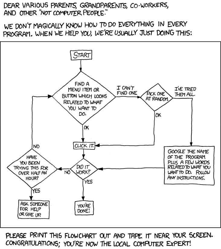
Also known as the poor bugger. So you can install simple software, fix minor computing problems, and you don't use CD-ROMs as coasters; this talent, according to your boss, makes you the ideal candidate to write the company/departmental/darts team blog. Never mind that you don't understand the content you have to write, the market you should aim for and that no one else will contribute in the writing of this dead albatross that is rapidly going mouldy around your neck.
To make matters worse, this kind of lousy experience is likely to put you off trying anything interactive online again. Hell, you're only here because you can print the right way up on headed notepaper first time. Take heart in the
flowchart!
Don't get me wrong, sometimes a blog is exactly what your organisation needs, but often it is just something that a senior manager heard about at a conference and has decided on one for no better reason than trend, usually an old trend by that point. Web presence isn't for everyone, and even if it is for you the type of presence you need isn't necessarily a blog.
Adam Maltpress, my web consultant of choice, has some wise words on his approach to creating a web presence:
"I just listen to what you want, tell you what might be good or bad ideas, then make it work.
That might mean creating you a web strategy which fits with your other communications - you know, "synergistically". It might mean guiding you through the basics of search engines, social networking, blogging and e-commerce. It might mean building you a site. It might mean managing your existing suppliers. Or it might mean telling you that a website's not what you need. Don't worry - I don't charge for that."
The Next Gen Blogger. Have I've just made that up? Probably.
The office expert leads me on to a new type of blogger and one the one I hope to be. When new types of social media become mainstream all sorts of people get on the bandwagon, now that this new innovation has been proven to have a relatively wide appeal and will not negatively impact on your organisation it becomes imperative that you must get one. Immediately. Even if you don't know how it works, whether it suits your business or not. These rushed blogs often become stale when they should be dynamic, are badly structured and don't speak to their audience. This doesn't just apply to corporate blogs, but to anyone who considers themselves a brand or wants to target a specific audience.
Reacting to this, the next generation blogger uses their blog in a subtly different way. It's still a web presence, it still represents them, their ideas and thoughts, but rather than just being a place to showcase them it becomes a place to form them. It sounds pathetic to admit it but I do think of myself as a bit of a brand. I try to keep my web presences unified: twitter, Facebook, LinkedIn, etc. so people can find me and so that a good idea on one site is associated with the others. I'm not fanatical about attracting followers, but I want my ideas to be heard. I work in a fairly isolated role, so reaching out to people is very important to me. Twitter is my main means of communication, but there are things I can't say in 140 characters, and that's where
beauty_school_dropout comes in handy. That's a pretty obvious use, a little less so is that keeping a blog helps me think.
I suppose it depends how your brain works, but I find fleshing out ideas in words helps me make to sense of them and draw my own conclusions. It's also the case that I tend to forget about things, especially films and books, if I don't go through the intellectual activity of reviewing them. I'll be sketching a quick pen portrait of a novel I've read and suddenly connections to other works become obvious. It's not just about the technique of reviewing: this started out as a short post and look where we are! I've had so many ideas since I started writing, many more than I would have if I'd just linked to the two resources at the bottom of this- both of them are written by men with beards, but that's all they have in common.
So why blog? To get your message out, or at least off your chest. To clear up confusion in your own mind and make concepts easier to understand for others. To form a record of your thougths and experiences, from the software you've toyed with to the beers you've quaffed. Most importantly for me, as a valuable reflection tool.
Extra Credit:
Why I Blog - Magazine - The Atlantic - Highly Recommended
Top Reasons Why I Blog | Online Social Networking


 KISS in blogs
 I recently created a new blog for my book group books@pub on tumblr. Now tumblr is where the cool kids hang out, they have a lot of really good themes which look slick on screen, but I did find it very difficult to use. From the dashboard I didn't find changing the design particularly intuitive, it didn't offer a live snapshot of what your blog would like like with each design, only what a very well executed and trendy blog with chunks of quotations and blurred photographs would look like. Blogger doesn't always fare much better. Without the Blogger in Draft Templates blogs can all begin to look the same, sure they're simple, but they can look like the ugly sisters compared to the standard Wordpress and tumblr designs. books@pub is a group blog which was not as easy to set up on tumblr as I anticipated, Wordpress I think is even worse for this. When you have multiple contributors it's important that it the registration process is simple for you and even simpler again for the others involved, who may not have the same levels of expertise.
 KISS for libraries


 You're going to need two things, something to read and something to read it on. The good news is that there's plenty to read, most newspapers, blogs and even LOLcats are available in RSS format. Now all you have to do it pick a reader. Some browsers, Firefox included, can understand RSS, but most people chose to access it through a web-based reader, a downloaded reader or via their email client. Web-based readers, Google Reader, for example, can be thought of as your inbox on the web. On the left you can see my a LOLcat RSS feed displayed on Google Reader.


 The good news is that you can enjoy beautiful, pared down design for almost-free on the web. I stumbled across this article from Smashing Magazine on minimalist web-design this morning, via the Librarian in Black's twitter feed. As well as tips on how to strip back on unnecessary content, use white or blank space to your advantage, and hints on image choices it showcases some mouthwatering examples of good design. The example on the left is from Anothercompany. The monochrome image in the centre makes a strong statement and it's fabulously clutter-free. Sadly it is under construction, so not much more than eye candy at present, but I find it an attractive design, and by far my favourite from the examples featured in the article.
 I don't think this is Chrome with a Firefox skin, although some people will feel that Firefox is leaning in too close to their rival. As much as I'm enjoying using Chrome at the moment, I still feel that Firefox has more to offer the user. I prefer their download manager, and the range of add-ons/ extensions is better and broader.


